The product design process
I was recently invited back to Ivey Business School to talk about the Product Design Process. I guess it’s a good sign if you’re invited back to do the same lecture once again, still, I can never shake the feeling of being way out of my depth when talking to a room full of really smart and bright people. But I guess it’s true what they say — when you’re way out of your comfort zone, that’s when you’re on the right path. I wanted to share a version of my talk online, even though transforming a talk to a blog post is never the same thing, especially this one as it lacks the thoughtful and engaged discussion I had with the students.
Introduction to Product Design
Product design isn’t just about making things pretty. It’s about making them work well for real people. It’s about identifying problems, ideating solutions, and packaging it in something that’s not just helpful, but joyful. Today, I’ll walk you through the core of product design, where AI fits in, and how we make design decisions that actually improve lives.
What does product design mean to you? If someone tells you they work with product design, what do you think they do? When we talk about product design, many think about physical objects. But in an increasingly digital world, you’ll see that physical and digital products share the same creation process. Over the coming hour, we’ll look more closely at the work we do as product designers and how much it shares with other principles of design.
“When you see an object, you may so many assumptions about an object. What it does, how well it’s going to do it, how much you think it should cost.”
“Ultimately my job as a designer is to look into the future, my job is to see what is going to happen, not what has happened.”
This is true for both physical and digital products, but in a digital world that moves so quickly, it’s even more important to understand this in a digital context.
What is Product Design?
Product design isn’t just about looks - it’s about solving real problems. It blends functionality, usability, aesthetics, and continuous feedback. Often people get caught up with the word design and focus on looks.
Design is how something looks, but also how it works, how it functions, what it does, how it does it, why it does it, and what many product managers tend to forget, ultimately design is just as much about what it doesn’t do.
Product Design Process
Let’s dive into the product design process, which is crucial for creating effective products.
- First, user research is essential. We talk to users to understand their needs and behaviors, their pain points.
- Next, we focus on functionality and usability. Our goal is to make products intuitive and easy to use, regardless of their type. Functionality includes scoping but more so prioritizing.
- Aesthetics play a vital role. Good design means a product is easy to use but also aligns with the brand in terms of positioning and market.
- Finally, prototyping, feedback and iteration are key. What can we build as easily as possible to test our assumptions, making the risk / reward ratio as beneficial as possible.
Let’s dive into each one of these and I’ll also share how I’m using AI to move faster and get better work done in each of the steps.
User Research
Great products start with understanding real users, not guessing their needs. Research helps businesses avoid costly assumptions, validate ideas, and build products people actually want. Understanding pain points is not just about understanding what the pain point is, but why and what impact it has on their daily life. How would their lives change if this wasn’t the case any more?
- Interviews reveal deep user insights through direct conversations.
- Surveys gather broad feedback to spot trends.
- Usability testing uncovers pain points by observing real user interactions.
“Great products start with understanding real users, not guessing what they need.”
How I use AI for User Research
I agree with the sentiment that AI isn’t going to take your job, but a person using AI is. With design, and perhaps user research especially, there’s a danger though on relying too much on AI. It’s so much faster and efficient, but much about user research is catching these brief moments of… humanity.
- Granola - I use Granola to transcribe and structure notes from UXR sessions.
- Zoom - I use Zoom to run calls, record them, and pick out important clips.
- Notion AI - Finally, all our research goes into Notion where we use Notion AI to search the full database of sessions.
“What you will get wrong is that you will not pay enough attention to your users.
You will make up some idea in your own head that you will call your “vision”, and you will spend a lot of time thinking about your vision. In a cafe. By yourself. And build some elaborate thing without going and talking to users, because that’s doing sales, which is a pain in the ass, and they might say no.
You will not ship fast enough because you’re embarrassed to ship something unfinished, and you don’t want to face the likely feedback that you will get from shipping. You will shrink from contact with the real world, contact with your users. That’s the mistake you will make.”
Paul Graham
Key takeaways
- The biggest mistake? Ignoring users. Many teams get caught up in their own ideas instead of talking to real people.
- The illusion of “vision.” It’s easy to fall in love with an idea in isolation, but without user input, it’s just a guess.
- Fear of feedback leads to slow progress. Teams delay shipping because they don’t want to hear negative feedback—but that feedback is essential.
- Reality check: Users shape success. The only way to build something people want is to engage with them early and often.
Functionality and Usability
A great product isn’t just about what it can do—it’s about how easily users can interact with it. Whether digital or physical, products should be intuitive, accessible, and effortless to use.
This means designing logical interfaces, clear navigation, and ensuring usability for people of all abilities. The goal is not just functionality, but creating an experience that feels seamless and enjoyable.
A product must first work—but great design makes it usable and even pleasurable. Usability isn’t just for people with disabilities; it’s about designing for real-life situations—tired users, distracted users, even drunk users. For Summer Health, a typical user might only have one hand available as they are carrying a child too.
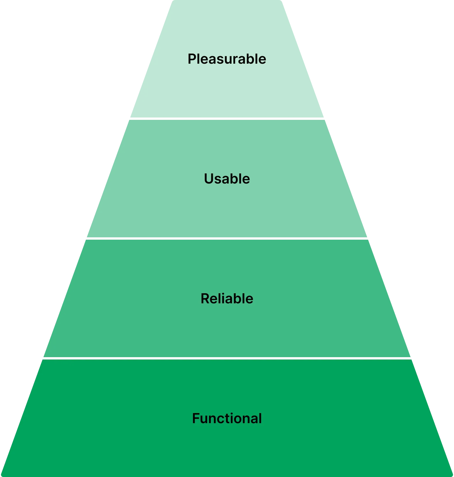
Maslow’s Hierarchy of UX Needs
- Functional – The product must work. (Ex: A banking app allows login, bill payments, and account access.)
- Reliable – Users need to feel safe and secure, especially in industries like banking.
- Usable – Navigation must be intuitive, and everything should work as expected. (This is where most products stop.)
- Pleasurable – The experience should be enjoyable, setting a new standard. (Robinhood disrupted finance by making investing feel effortless.)
Here’s how I use AI for Functionality and Usability
- ChatGPT - I use ChatGPT as a quick research tool as well as a sparring partner for bouncing ideas off.
- Summer Health Copywriter - I’ve setup a chat agent to write copy for my designs based on our brand voice.
“Bullsh*t. Look around you. You make choices based on design every day.
Even if you can’t design those things yourself, that doesn’t take away from your ability to decide that was the chair you wanted to sit on, or the shoes you wanted to wear, or the car you wanted to buy.
You know bad design when you encounter it. From every chair you’ve sat in that hurt your ass, to every coffee cup that burned your hand, to every time your finger triggered the wrong link on your phone, to every airline booking site that pissed you off. You know bad design. You hate it.”
You’re my favourite client by Mike Monteiro
Key takeaways
- Design influences decisions – Whether we realize it or not, design impacts every choice we make. You don’t need to be a designer to recognize bad design – Everyone has experienced frustrating design, whether it’s a bad chair, a confusing interface, or a terrible airline website.
- Usability matters because bad design creates frustration – A product can be functional, but if it’s difficult or unpleasant to use, people will avoid it. Great UX isn’t just nice to have—it’s expected – Users don’t tolerate bad design, and businesses that ignore usability will lose to those who prioritize it.
Any specific products that come to mind? Google Slides is my pet peeve!
Visual Design
Good design isn’t just about making things look nice—it’s about making them work better. A well-designed interface guides users, reduces confusion, and makes interactions feel effortless.
Good design isn’t decoration—it’s clarity.
Key Principles of Visual Design
- Hierarchy – Directing Attention - Good design helps users focus on what matters. Think of a landing page—what’s the first thing you notice? A headline? A call-to-action button? That’s because designers use size, color, and spacing to create visual hierarchy. Without it, everything competes for attention, and the user doesn’t know where to go next.
- Consistency – Making Things Feel Familiar - Our brains love patterns. When buttons, menus, and layouts follow consistent rules, users don’t have to think—they just know what to do. Imagine if every app had a different way to close a window. You’d go crazy! Consistency builds trust and makes interfaces feel intuitive.
- Typography & Color – More Than Just Style - Typography and color aren’t just about aesthetics; they directly impact usability. Ever tried reading light gray text on a white background? It’s painful. High contrast improves readability, and font choices can change how a product feels. A financial app might use a bold, trustworthy font, while a meditation app might go for something soft and friendly.
- Simplicity – Less is More - One of the biggest mistakes in design is trying to add more instead of simplifying. Every element on the screen should serve a purpose. Apple is a great example—think of their product pages. No distractions, no clutter, just clear messaging and intuitive navigation. Simple doesn’t mean boring; it means clear.
Good design isn’t about decoration—it’s about clarity. When a product is visually well-designed, users don’t have to struggle to use it, they just get it.
Here’s how I use AI for Visual Design
- Visual Electric - I use Visual Electric to prompt for images that are impossible to find among stock libraries, like crying babies or a child with a rash (not to mention families that aren’t white middle class…)
- Stark - I use Stark to check design for color contrast and accessibility.
Key takeaways
As we’ve seen, visual design is not just about aesthetics—it’s about function, clarity, and guiding the user experience. But that doesn’t mean beauty doesn’t matter. In fact, great design balances usability and aesthetics. Not balance because it’s suggesting there’s trade-off, but a great play between the two.
That’s why I love this quote:
“Don’t make something unless it is both necessary and useful; but if it is both necessary and useful, don’t hesitate to make it beautiful.”
Joshua Porter
Great design is not just about what a product does, but how it makes people feel. If we can create something functional, reliable, and easy to use—why not make it beautiful too?
Prototyping and iteration
One of the biggest differences between physical and digital products is how they evolve over time. Physical products are locked in once they’re manufactured—if there’s a flaw, fixing it means going back through the supply chain, redesigning parts, and waiting months before customers see an improvement.
This agility allows for continuous refinement—testing, learning, and improving over time. Instead of aiming for perfection before launch, great digital products embrace iteration, ensuring they stay relevant and meet user expectations.
Digital products? Completely different story.
- Digital Products Are Built to Evolve - In the digital world, we can iterate fast. If a feature isn’t working, we tweak it. If users are struggling, we refine the design. This ability to make quick updates means that digital products aren’t just launched—they’re constantly evolving.
- Speed Matters – Learn & Adapt Quickly - Companies that embrace fast iteration have a huge advantage. They don’t wait for the ‘perfect’ product; they test, release, gather feedback, and improve. Think about apps like Instagram or Spotify—do you remember their first versions? Probably not, because they’ve evolved so much through continuous updates and user feedback.
- Iteration vs. Perfection - Too many teams get stuck trying to make something perfect before launch. But perfection is a moving target—what works today might not work tomorrow. Instead, the best digital products focus on learning, adapting, and improving over time.
The real power of digital products isn’t just that they can change—it’s that they must change to stay relevant. The best products are never truly finished.
Here’s how I use AI for Prototyping and Iteration
- Lovable, Replit and V0 - I use tools like lovable, Replit and V0 to build actual prototypes quickly which are much more useful than static screens or Figma prototypes when getting feedback.
- Cursor - I use Cursor as my primary IDE for writing code and content.
“I also make a point to regularly speak with customers. This is something a lot of people shy away from, because it’s uncomfortable.
This is something I remember learning from Ryan Delk years ago. He’d meet people who said they used his product, and he’d say, “That’s amazing,” but then immediately follow with: “What could we do better?”
It’s such a simple question, but a scary one. Most people would rather ask what someone loves about their product because it feels good, and it’s less painful.”
Nathan Barry
Key takeaways
As we’ve discussed, digital products have the unique advantage of being able to evolve. But to improve, we need one critical thing—real feedback.
Yet, many teams shy away from it. They’d rather hear what people love about their product than face the hard truth of what’s not working. But the best products don’t come from avoiding discomfort—they come from embracing it.
The best teams don’t just listen to feedback—they seek it out. They don’t wait for problems to show up—they go looking for them. Because every great product is built, not in isolation, but in constant conversation with its users.
Tying It All Together
So, what makes a great digital product? It’s not just about having a good idea, or even strong execution. It’s about constantly learning, improving, and evolving. Let’s go over the key takeaways one last time.
- Understand Your Users – Research, Don’t Assume - We started with user research because it’s the foundation of everything. The biggest mistake teams make is assuming they already know what users need. But the best products don’t come from guessing—they come from listening.
- Design for Usability – Functionality First, But Make It Intuitive - A product isn’t great if people struggle to use it. Functionality is the starting point, but usability is what makes it successful. No one wants to fight with an interface just to complete a simple task.
- Make It Visually Clear – Design Guides Users, Not Just Decorates - Visual design isn’t just about aesthetics—it’s about communication. A well-designed product removes confusion, builds trust, and makes interactions feel effortless. It’s not about making things ‘pretty’—it’s about making them clear.
- Iterate & Improve – The Best Products Evolve With Feedback - The best digital products aren’t built in one go. They launch, they gather feedback, and they improve over time. The biggest difference between a mediocre product and a great one is the willingness to keep refining.
At the end of the day, great products aren’t built in isolation. They don’t come from just one person’s vision—they’re shaped by real users, continuous learning, and thoughtful design. And the teams that embrace this mindset? They’re the ones that build products people love.
Did you enjoy this article?
Join 3,000+ designers, developers, and product people who get my best ideas about design each month.