Designing for anyone: the power of accessible products
For years, I viewed accessible design as a set of boring and restrictive rules. Text contrast ratios, focus states for buttons - these were things I thought made design worse, not better. I wasn’t alone in this mindset. I’ve heard colleagues dismiss accessibility concerns, saying things like, “We’re not going to have any blind users, so it’s not going to be a problem.” Or designers insisting that light grey text is perfectly readable because they can see it with their poor eyesight.
But lately, I’ve been trying to shift my mindset on accessibility. I’ve realized that accessible design isn’t just about adhering to technical guidelines - it’s about creating products that work for anyone, in any situation.
What accessible design is really about
Here’s a powerful idea that’s changed my perspective: Accessible design isn’t designing for everyone, it’s designing for anyone (thank you Cat Noone). This subtle shift in thinking opens up a world of possibilities and challenged me to think more inclusively about our users.
Though I’m not a parent myself, I’ve spoken to many parents and identified a common theme particularly related to accessible design. Having a newborn can be incredibly stressful, especially when the baby isn’t feeling well. When your child is endlessly crying with a fever and you’re sleep-deprived, confetti on the screen for logging in five days in a row isn’t going to improve your mood. What will help is being able to easily navigate an app that uses clear, easy-to-understand language. Connecting with a pediatrician and getting that eRx sent to your closest (night-open!) pharmacy for immediate pickup is what matters. Just as there are times for bells and whistles in our apps, there are also times for… efficiency.
- Ensuring your users can use your products in less-than-ideal circumstances:
- Picture a parent trying to use an app while holding a baby. Can they navigate your interface one-handed?
- Think about someone using your product on a bright sunny day or in a dimly lit room. Is your content still readable?
- Making your product understandable without requiring a PhD or deep tech knowledge:
- Can a first-time user intuitively navigate your interface?
- Is your content written in clear, jargon-free language?
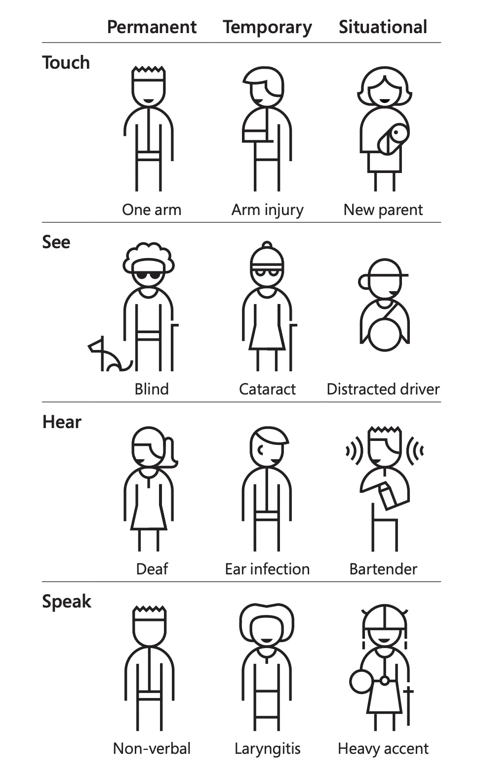
- Considering the full spectrum of user abilities and situations:
- Permanent conditions: Like being blind or deaf
- Temporary states: Such as having an ear infection or an injured arm
- Situational challenges: Using an app while drunk, distracted, or in a noisy environment
The ripple effect of accessible design
Once you start thinking about the situational scenarios that anyone might experience, you’ll find it easier to discover what the temporary states might be. And once you’ve explored temporary states, you can consider that they might not be temporary for everyone.
This approach of designing for anyone doesn’t just benefit users with disabilities - it improves the experience for everyone. A design that works well for someone with one arm will also work well for a parent holding a child. Captions don’t just help deaf users; they help anyone watching video in a noisy environment or without headphones.
Microsoft (surprisingly!) has an excellent resource for Inclusive Design. I’m particularly fond of the Inclusive 101 Guidebook—page 22 is pictured below:

Changing our perspective
The key to truly caring about accessibility is to stop thinking about it as a set of restrictive guidelines and start seeing it as a way to make our products more usable and inclusive for anyone. It’s not about limiting our design choices; it’s about expanding our understanding of how people use our products in the real world.
By shifting our focus from designing for everyone to designing for anyone, we open ourselves up to a more empathetic and inclusive approach. We’re not trying to create a one-size-fits-all solution, but rather a flexible, adaptable design that can accommodate a wide range of users and scenarios.
So the next time you’re tempted to use that light grey text because “it looks better,” or skip adding alt text to an image because “it’s not important,” remember: accessible design isn’t just about following rules. It’s about creating products that work for anyone, anywhere, anytime. And isn’t that what great design is all about?
Did you enjoy this article?
Join 3,000+ designers, developers, and product people who get my best ideas about design each month.