What´s Good Design?
September 04, 2017There are just as many opinions on what ‘good design’ is as there are ‘designed’ objects. While some believe that good design is merely a visual characteristic, others claim that function should always trump form to be good design.
Dieter Rams, legendary designer, crafted ten rules of what good design is. Even if you’re not familiar with Dieter’s work, you’re probably familiar with work that’s highly inspired by it!
Anyways, the ten rules that Dieter set were the following:
  1. Good Design is Innovative
  2. Good Design Makes a Product Useful
  3. Good Design is Aesthetic
  4. Good Design Makes a Product Understandable
  5. Good Design is Unobtrusive
  6. Good Design is Honest
  7. Good Design is Long-lasting
  8. Good Design is Thorough Down to the Last Detail
  9. Good Design is Environmentally Friendly
  10. Good Design is as Little Design as Possible
While most of these are pretty obvious, there are a few that I’d like to take a closer look at.
Good Design is useful AND understandable - and they are not the same
Dieter clearly states that making a product ‘useful’ and ‘understandable’ are two different concepts and often companies will confuse the two when developing new products. They assume that “this is really useful (for us) so it’s surely understandable (at least for us) as well.” As the barriers to creating new products have lowered for years, it seems we’ve been less inclined to ask ourselves, “Is this useful?” We now have access to more and more frameworks, allowing us to have something up and running in just hours, but we’ve started to skip asking ourselves, “Is this understandable?”
Good Design is as Little Design as Possible
Some weeks ago I relaunched my website and one of the comments over at DesignerNews was the following:
Redesign? There is no design? Simple white page with text..
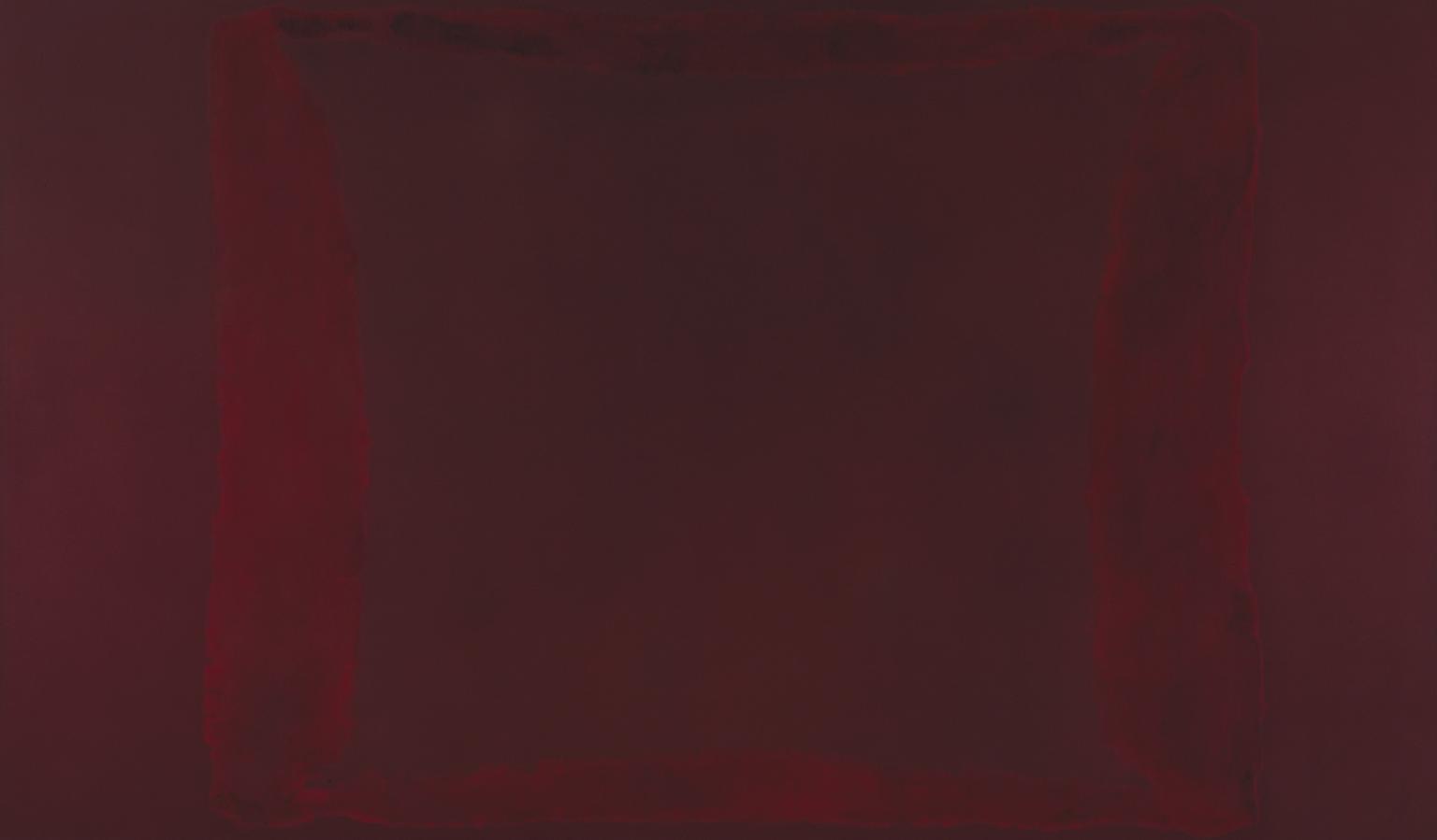
While I can see what this person means in theory - I’m confused as what would require for something to ‘be a design’. Colors? Shapes? Is a Mark Rothko not as much a painting as a da Vinci because it has no clear motif?

You know bad design when you encounter it. From every chair you’ve sat in that hurt your ass, to every coffee cup that burned your hand, to every time your finger triggered the wrong link on your phone, to every airline booking site that pissed you off. You know bad design. You hate it. -Mike Monteiro
Everything is designed. The only difference is how much effort that has been put into the design. Nothing is “un-designed”. Even that Comic Sans note in your copier room - is designed by someone (who clearly shouldn't be in charge of making notes).
I want my content to be in focus. I want to give my readers a pleasant reading experience without any email opt-ins popping up. There will be no “lead forms” and no bright colors to sway their eyes in a different direction. To me, that’s good design. To others, that’s apparently ‘no design’… 🤔
What I’m missing - Good Design is Uniting
One of my favorite designed products is my bike. Even though I’m a neutral-colored kinda guy , I love the look of my golden Martone bike.

I love it’s clean lines combined with the attitude of that golden yellow color. I use it far too little, but whenever I do I hear people - mostly 15-year old boys - shout, “Wow, look at that cool bike!” So while the design preferences of myself and a 15-year old boy is surely different from each other, we’re still united in our love of this designed product.
I really wish we’d see that more in digital products too.
Learn how to create better user experiences
Join thousands of designers, developers, and product people from companies like Amazon, IDEO, Figma, and Shopify. A couple of times a month depending on life.